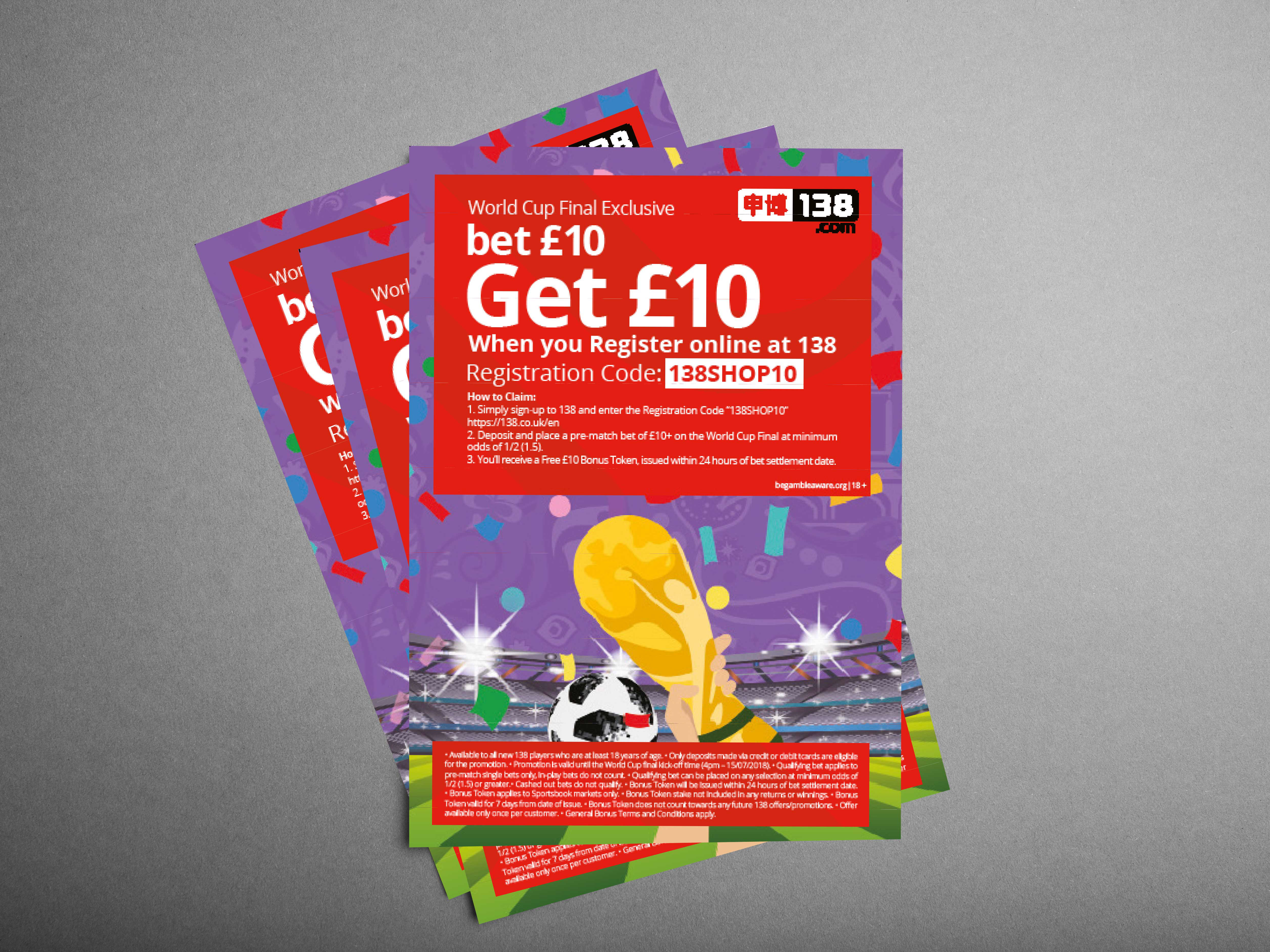
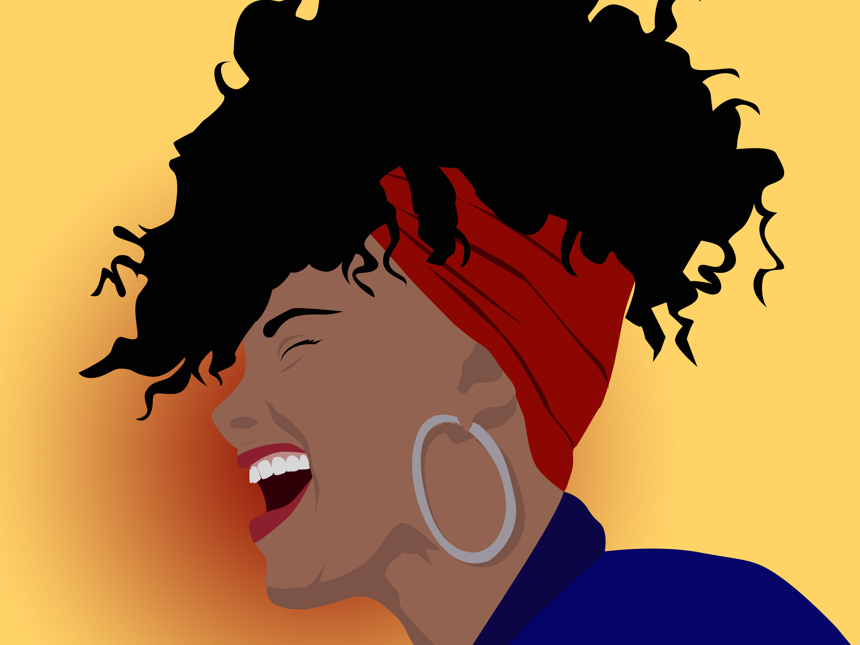
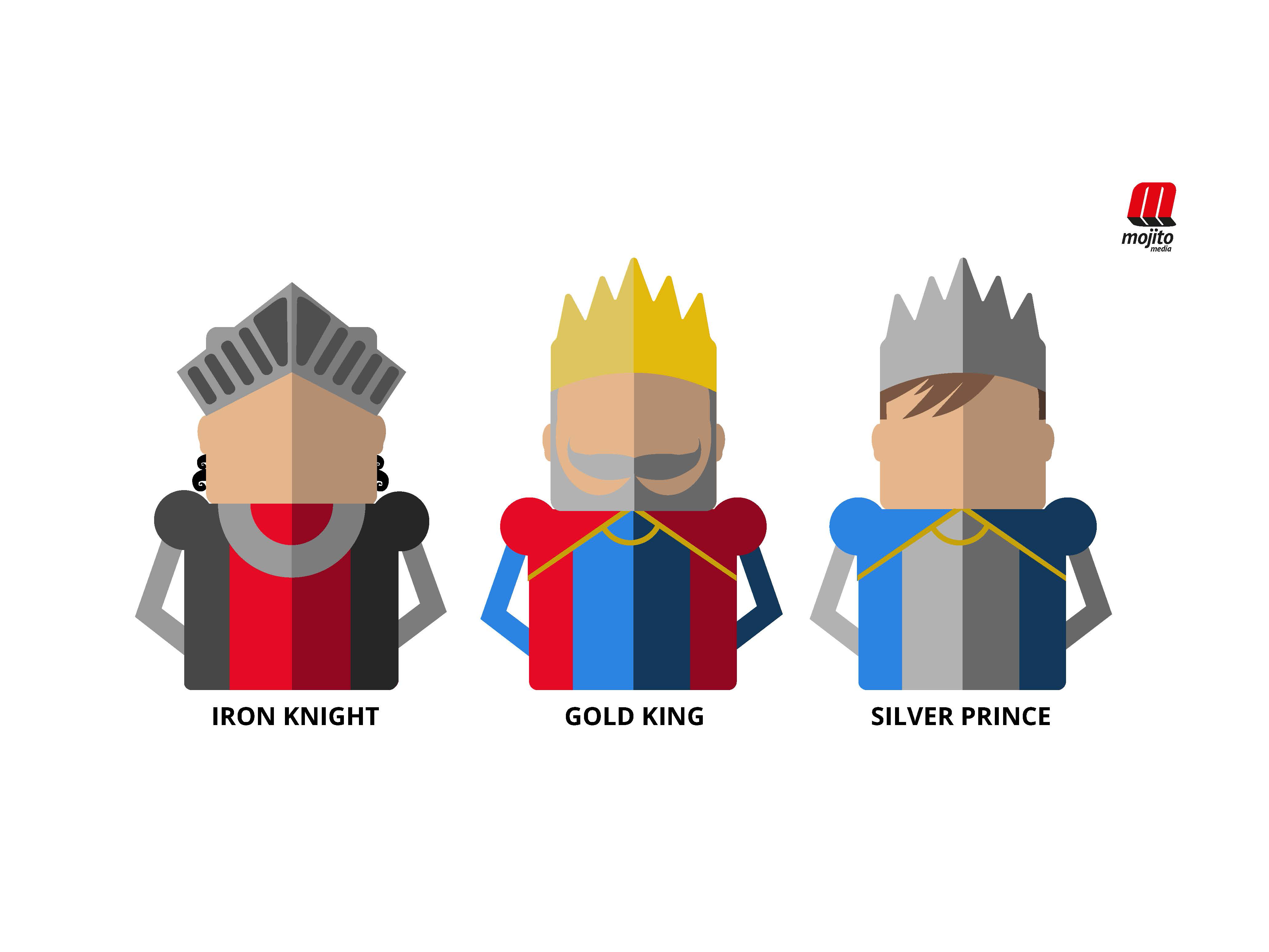
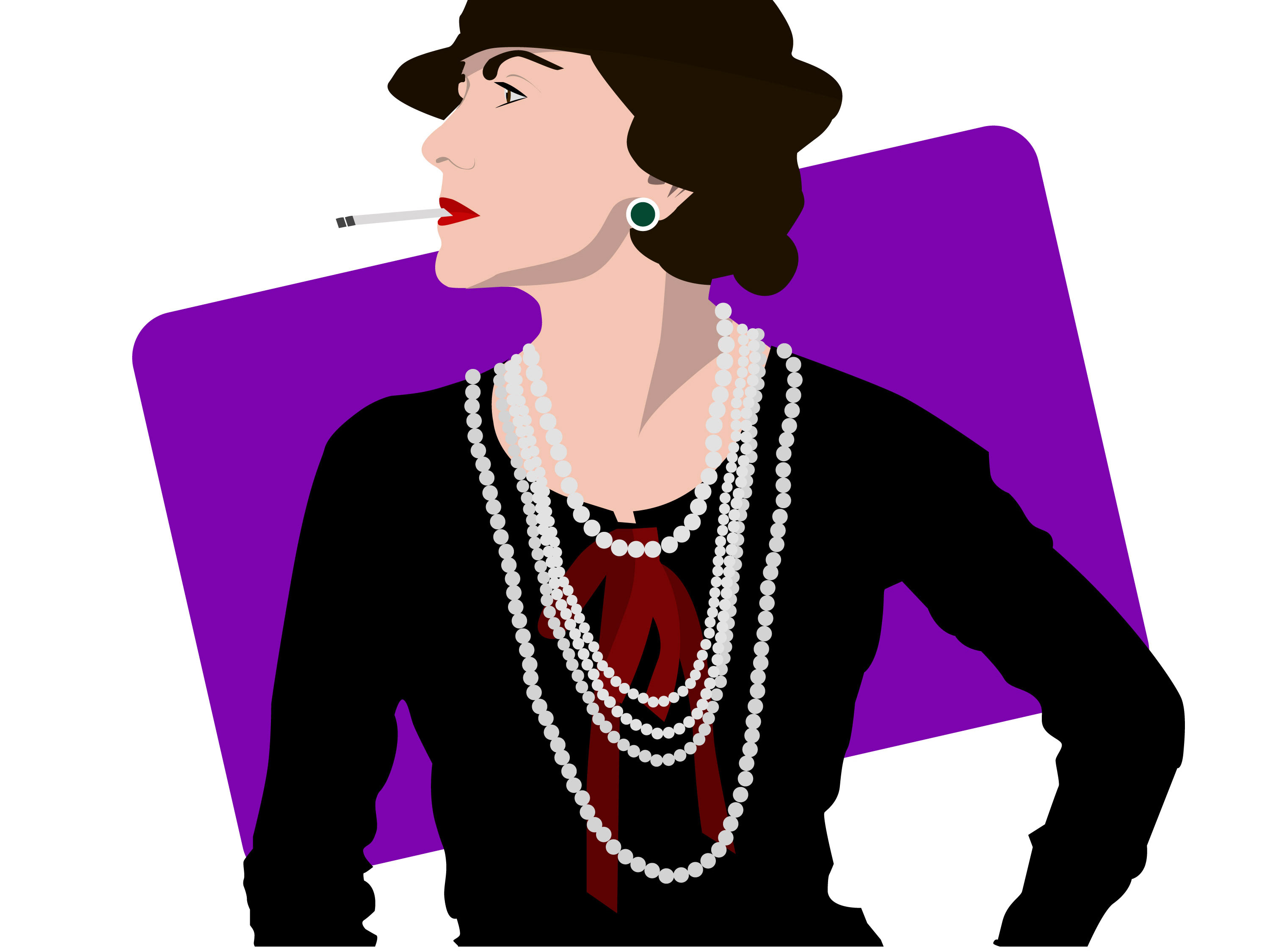
These illustrations were created as part of a rebranding. 138 wanted to create a new style based on illustrations and a more modern style for the sports industry.
After long research and differnet style sketches we decided to go for a flat style that would match with the rest of the brand.


